
Vesti
A Responsive E-Commerce Website

Project Overview
Challenge
Mirror, is a global clothing chain with over 400 stores worldwide and over 26 years of success offline. Recently their loyal customer base has been asking them to take their brand online, because they want to have the choice to shop while on the go. Due to this, Mirror has decided that the right business decision is to go online and they have reached out to me to help them.
Mirror wants to have an e-commerce website and to do a re-brand. They want to stay current and competitive in the online clothing market so they are considering changing their name to Vesti trying different brand identities until they find what represents their brand best.
Solution
Design a responsive e-commerce website.
Develop Mirror’s brand, logo and visual identity.
Project Scope
Responsive e-commerce website, branding, logo.
Tools
Sketch, InVision, OptimalSort, Pencil, Paper, Procreate.
Role
UX Designer (Research, Visual Design, Interaction Design, User Testing).
Team
Self Directed, with feedback from mentor and peers.
Duration
8 weeks.
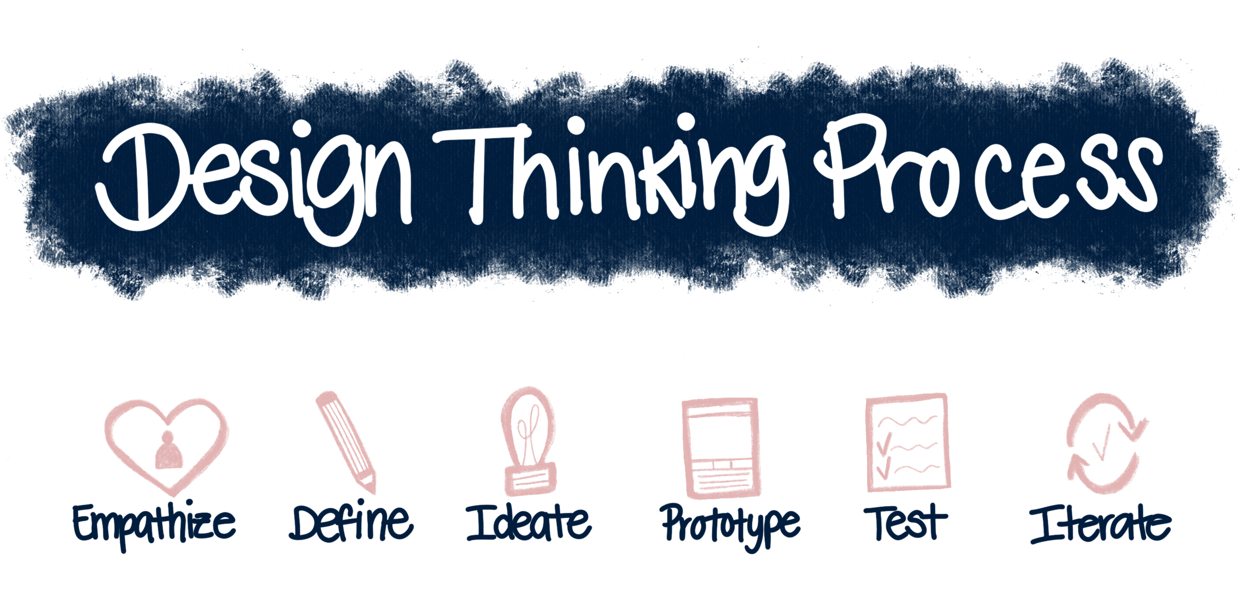
01. Empathize
Market Research
Before conducting research, I created a Research Plan document to help me put together my research goals and objectives.
The first step of this project was to familiarize myself with the current global e-commerce market industry. I researched about online clothing shopping trends, news, current online shopper demographic and gathered information from existing case studies. This information helped me confirm and invalidate assumptions I had about users and their expectations regarding shopping for clothing online.
Global E-Commerce Market
There will be an increase of online shoppers in the US by the year 2023. Expecting 300 million of online shoppers, 91% of the population. This possibly has to do with the outbreak of COVID.
49% of people shop through their phones, so an optimized website is important.
Demographic
As of today, Millennial women represent the retailers’ Golden Ticket. They control/influence 70-85% of household spending.
68% of Millennials demand an integrated, seamless experience regardless of the channel (online or in-store). Being able to transition effortlessly from smartphone to personal computer.
Competitive Analysis
Next, through conducting competitive analysis, I was able to identify other companies occupying the same problem space as Mirror. I focused on breaking down these company's strengths and weaknesses regarding the products and services that they offer their users through their website to understand their approach at solving similar problems to Mirror’s.
User Interviews
With a better understanding of the market and competitors, I created an Interview Guide to prepare for the user interviews. I conducted the interviews through Zoom with 5 female participants that fit Mirror’s user demographic. Through interviews, I was able to learn about the participant’s goals, needs, frustrations, motivations and preferences while shopping for clothing online, by asking them open-ended questions.

“I try to buy everything online because I find it much easier. For me the pictures a website has are important, that the layout of the website is straightforward, easy to follow and linear and that they have a description box.”
Participant #1, 29
“When I am buying online it is very important that there is an easy and fast checkout, that there is an option for shopping as a guest, because I do not like having to register.”
Participant #2, 37
“I think having a smooth cart experience is important. I like that if I've shopped at a store before they already have my information saved, so it's usually a pretty straightforward process. Because they have my account, I just do two clicks and it's done, I have made my purchase.”
Participant #3, 29
Empathy Map
By gathering all the interview findings into separate colored sticky notes, per participant, I was able to create an Empathy Map. This allowed me to organize the research findings, identify patterns most common amongst participants, uncover insights and define the needs of the users.

Insights
Focus on purchasing from brands they know.
Look online for good quality clothing products.
Look at online shopping as a quick way to shop for clothing.
Shop online to find the best discounts.
Like to shop on websites that have a simple layout.
Rely on detailed product information to make their product choices.
Needs
Know that the sizing chart is accurate.
Find a product that is of good quality.
Save time when shopping online.
Save money.
Shop efficiently.
Find detailed product information.
02. Define
User Persona
With the insights and needs gathered from the empathy map, I created a user persona that will help me better empathize with the user throughout the design process.
Amanda, is a realistic representation of our target user, their goals, needs, motivations and frustrations.
Project Goals
Now that I have a user persona, I moved on to creating a Venn diagram composed of the synthesized information from research and the client’s project brief. I focused on laying out the business and user goals and technical consideration to keep in mind. Defining and understanding the individual goals, along with the mutual goals, helped me when making decisions throughout the design process.

Card Sorting
Now that I have a better understanding of the project goals, I move on to conducting a remote Open-Card Sort exercise, to help me get user feedback and observe how users naturally organize a variety of clothing items. In this study, I discovered that the most common trend, amongst the 10 female participants, was to categorize the cards by the type of item. With this information I will be able to put together the Information Architecture of Mirror.

Insights
Participants created a total of 58 categories with a median of 6 categories each.
Most common agreed on categories: Accessories, Tops, Bottoms, Footwear, Outerwear, Summer and Winter.
Majority of participants said they chose the categories based on the item/product.
Sitemap
Working with the results gathered through the card sorting exercise, and research done on competitor websites, I put together a Sitemap. This sitemap showcases the hierarchical organization of content and features and helps me visualize Mirror’s website structure.

03. Ideate
Product Features Roadmap
By referring back to my research and user persona, I was able to create a Product Features Roadmap. This document helped me prioritize the list of potential features for the product in order of priority based on the terms of development, execution and effort to implement.

User Flow
I then created a User Flow to explore different actions, paths and decisions that a user would take while trying to achieve the task of purchasing an item from Mirror. This flow will help guide me through the design process, to assure I am focusing on the efficiency and ease of navigation of the website’s interface.
Wireframes Sketches
Before creating digital wireframes, I did a brainstorming session to quickly sketch some wireframe ideas for Mirror’s homepage. By doing this, I was able to sketch out different layout ideas for displaying the content and invite feedback early on from peers to help me find the gaps.

Mid-Fidelity Responsive Wireframes
I then digitized the layout, for the different devices our user would visit our website through, that I felt fit best the needs of the client and user. These allowed me to explore the best way to lay out the content’s hierarchy digitally and to create the blueprint for the website, before adding color and images.

Logo Design
To create Mirror’s logo, I needed to keep in mind their brand attributes of modern, fresh, neutral, clear and minimalist. To do this, I gathered inspiration on Pinterest and created a Mood Board.
I then moved on to quickly sketching a few wordmark logo ideas. I vectorized the logos I felt best represented Mirror and displayed them in different scales. This allowed me to verify which Logo, of the chosen, no matter the size was still readable and recognizable.
Style Title
After establishing a visual direction, I put together a style tile for the Mirror brand. This will serve me as a reference for the branding guidelines when creating the website's user interface design.
Desktop High-Fidelity Wireframes
By using the wireframes previously created and the style tile, I was able to create the high-fidelity wireframes. These wireframes will be used to put together the prototype for usability testing.

04. Prototype
Desktop Prototype
I used InVision to create the scaled-down interactive and clickable prototype that includes all of the necessary pages that will allow users, during usability testing, to complete each of the task flows outlined during the ideation phase.
05. Test
Usability Testing
Before testing, I put together a Usability Test Plan as a roadmap for how the tests will be conducted.
To gather usability feedback from participants and uncover if the features are useful and solve the users problems, I conduct a usability test with 6 female participants.
Through this test, I was able to uncover gaps within the design that caused confusion for the users, validate or invalidate assumptions that were made along the design process and learn more about the users thoughts, behaviors, goals and motivations as they performed each task.
Overview
Conducted moderated remote usability tests through Zoom. Acted as the moderator and encouraged users to think aloud during the testing process.
Participants
Number of participants: 6
Age range: 29-34
Gender: Female
Tasks
Find an orange long sleeve sweater.
Find more information about the sweater.
Purchase the long sleeve sweater in a size small.
Affinity Map
To synthesize all of the data gathered during testing, I created an Affinity Map. Through this tool I was able to uncover the most prominent frustrations users had during testing. These frustrations were clustered to reveal insights that were then synthesized further into recommendations. The recommendations are to inform the next iteration of the website design.
Insight
Issue 1
Users mentioned that the four category images on the top of the Women’s Page slowed them down from finding the categories list, where they needed to find the sweaters text link.
Recommendation
Fix 1
To remove the four categories on the top of the Women’s Page and move the categories list up on the page, to allow the users to quickly find the list (High Priority).
06. Iterate
Priority Revisions
Based on the recommendation found through the affinity map, priority revisions were made to the high-fidelity wireframes and then prototype to insure a useful and positive user experience.
UI Kit
Now that the priority revisions have been made, I put together a well-labeled UI Kit, that includes all of the UI elements and design patterns found in Mirror’s website.
This document contains accurate design specifications that will be shared with developers and designers that may collaborate on development and iteration on the design of Mirror in the future.
Updates
During Mirror’s first design round, I worked through tight deadlines to create the e-commerce website and branding for Mirror. For this second round of iterations, after getting feedback from my mentor and peers, I was able to re-work on some of the deliverables to assure that Mirror’s website brand aligns with their goals and their website has the proper features needed to be useful and successful when launched.
Project Goals- Iteration
By gathering feedback from the client and users through testing and iterations, I was able to validate and invalidate the goals outlined within this tool. For this iteration, changes were made on the business goals and Technical considerations. The business goals are now more clearly defined and updated to represent the current goals of the client and the technical considerations now better represent the elements needed to make the website accessible to all kinds of users.
Product Features Roadmap- Iteration
For the Feature Roadmap, I focused on iterating on a few elements and advocating for my user Amanda. Updating features and their names to the correct terminology and the order in which they would be developed and executed, updating the layout with Airtable and adding other elements to make a more comprehensive document. I added a User Story section. I used this new method to help me verify the functions of each priority feature through the user’s perspective and to find out the how and why the users would benefit from each priority feature.
New sections
Goal of the Feature- Different business and user goals that I believe can be achieved through each feature.
User Story- To help verify the functions of each priority feature through a user perspective scenario that tells me how and why the user would benefit from the feature.
Brand Logo- Iteration
For this deliverable, I decided to start from scratch. Why? Because I felt that the brand attributes and brand name no longer represent the client’s brand vision, their trajectory as a company and what they want to achieve with this new e-commerce website.
I went back to the drawing board and came up with 3 new brand attributes and a new brand name, Vesti, which in Italian it means to “dress up” that best describes the brand and our user persona, whom they want to cater to.
Vesti is
Adaptable- Open to change and growth- Launching a new website!
Reliable- They know they are a trusted brand because they have been in the clothing industry for many years.
Confident- They are a confident brand because they know they offer good quality products and have a good variety and selection.
Style Tile- Iteration
With a new brand name, wordmark and brand attributes, I needed to update the color palette in the Style Tile. I updated the brand and accent Colors to assure they represent the new brand attributes and have a great contrast ratio against the site’s background and text, then the previous colors chosen.
High-Fidelity Wireframes- Iteration
Now that a new brand and visual identity has been established, I move on to implementing them throughout the high-fidelity wireframes and prototype. I made adjustments to existing design patterns, added extra wireframes needed, added the different states of certain components, added the new brand logo and updated the brand and accent colors through the wireframes. These changes were made to make sure the Vesti website is accessible and useful for users.
This new version is more comprehensive and showcases how the real website will look like and operate.
UI Kit- Iteration
After all of the design elements were added to the high-fidelity wireframes and the prototype, I updated the UI Kit to reflect the new elements. This UI Kit will be included within the hand-off document that will be given to the developer.
Final Thoughts
For Vesti’s e-commerce website, I aimed for making a highly valuable product that is useful and accessible, to assure that users can have a pleasant and efficient shopping experience with our product.
1. Familiar Design Patterns
One of the things that I learned through research of competitor websites and user testing, is that users have an easier time navigating through websites that include design patterns that are familiar to them. By using familiar design patterns, as designers, we are able to create useful, efficient and enjoyable shopping experiences.
2. Trying out New Methods
One thing that I focused on during the second iterative process, to assure that I dug deeper and uncovered more insights, was to find new methods to use and new ways to use the methods I had previously used. This allowed me to see each method from a new angle and gain deeper empathy and understanding for the user.
Through this I’ve learned that by being open to trying new methods and finding different ways to solve problems, is making me a stronger designer and allowing me to better advocate for the user.
Next Steps
Design Implementation & Hand-off
Now that the design has been tested, revised, and completed it is ready to get developed and go live in the market. To achieve this, I have put together all of the product deliverables, using the Zeplin tool, for handoff to the developers. After handoff I will continue to be available to assist or answer any questions that may arise during the development process.
Maintenance
Updates and revisions will continue to be done to Vesti’s user interface as technology changes and advances and the needs of the business and users change.