Memrise
Integration of a new navigation feature to the language app
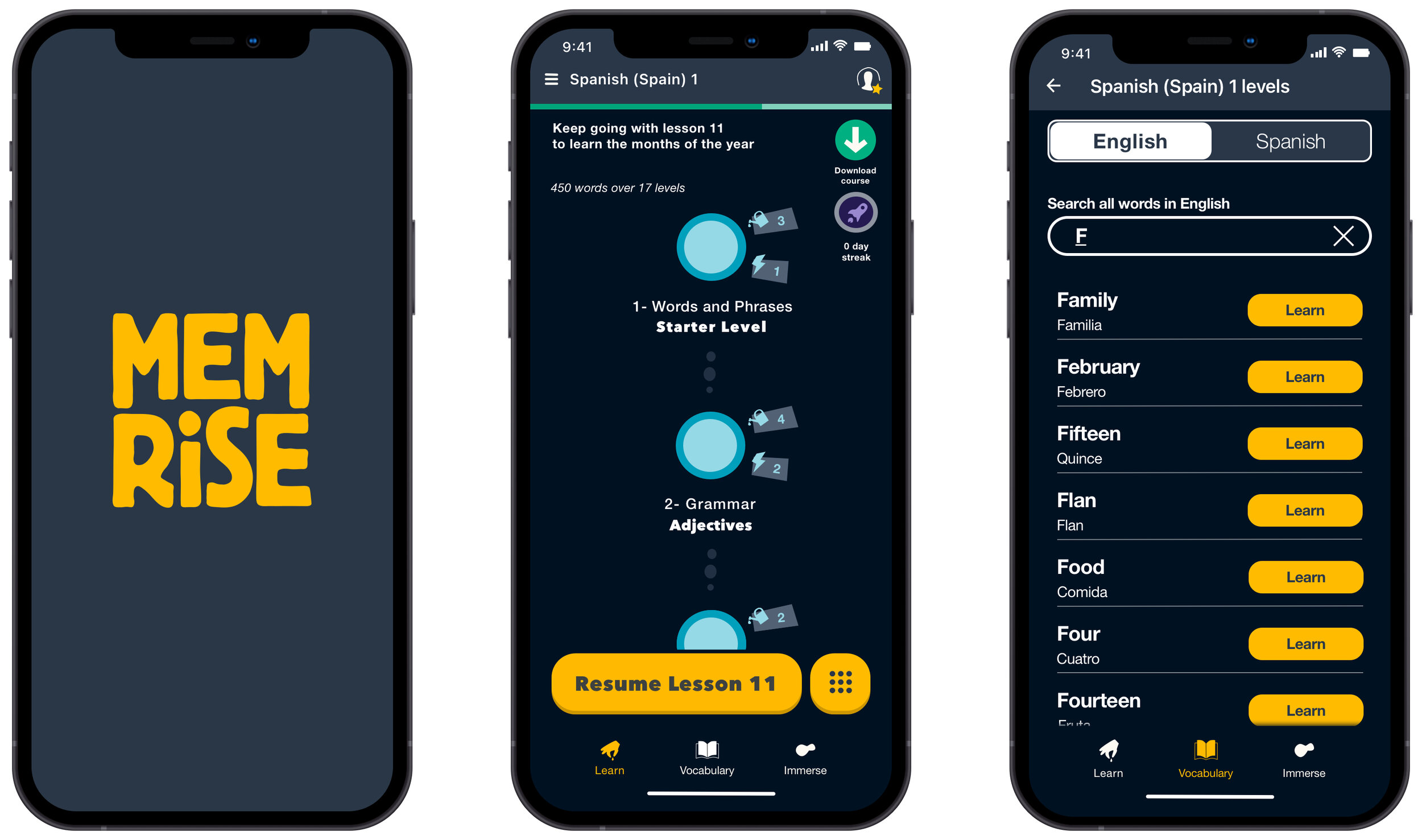
Project Overview
Background
Memrise is a paid British language platform that was founded back in 2010. The company has quickly grown to have more than 50 million people in over 189 countries learning languages with them. Memrise aim is to help their users learn a language fast through spaced repetition flashcards.
Challenge
Users have voiced having problems with Memrise course path. Users have found the course path too rigid and feel there are a lot of constraints on how they can interact with the content, within the app.
Solution
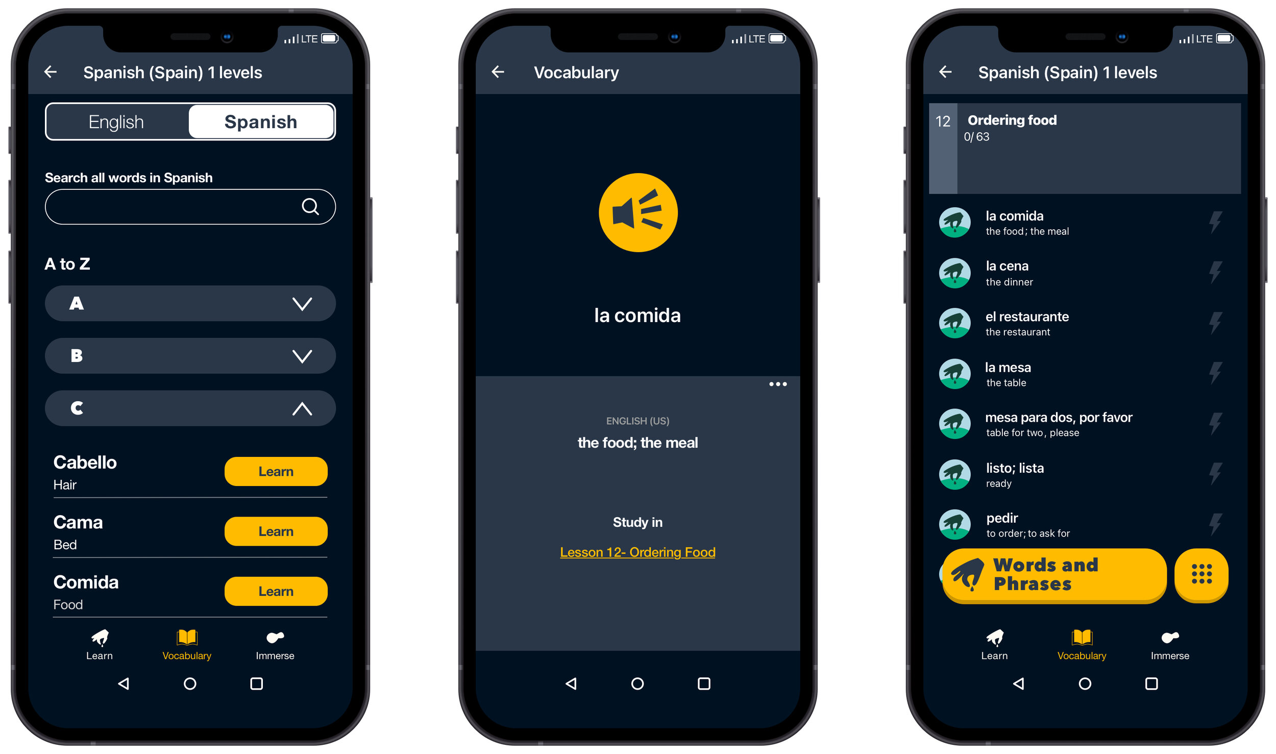
Design new features for the Memrise mobile app that will allow users to easily interact and navigate through the app’s content.
To integrate these features seamlessly within the rest of the app.
Project Scope
Mobile app new navigation feature integration.
Tools
Sketch, InVision, Conceptboard, Procreate, Pencil, Paper, Sticky Notes and Zeplin.
Role
UX Designer (Research, Visual Design, Interaction Design, User Testing).
Duration
80 hours over a 3 week period.
01. Empathize
Competitive Analysis
After learning more about the language app market, I conducted a competitive analysis where I compared Memrise navigation design to other language apps in the marketplace, to help me see the gaps and opportunities for the Memrise app. This research gave me a better understanding of competitors' different navigation features and how they have implemented them to help their users have a more friendly, flexible and easily accessible interaction with the app.
I will use this document as a reference during the ideation process when deciding what features to build and what is the best approach for Memrise.
Empathy Map
Before moving on to conducting user interviews, I did an empathy map exercise to help me uncover any gaps in my current assumptions and knowledge of who the Memrise user is and his needs. I achieved this by putting myself in the mindset of the user and thinking of his possible environment, to help me explore what he might feel, think, do and say as a language learner today.
Through the findings of this empathy map, I was able to ask myself how confident I felt about what I know, what I think I know and what I don't know regarding my assumptions. Once I answered those questions, I came up with the list of questions to ask participants during the user interviews that would help me cover those gaps in my knowledge and help me create my user persona.
User Interviews
Now that I have a better understanding of the market, competitors and Memrise possible user persona, I moved on to conducting 1:1 interviews through zoom.
I spoke with 3 language app learners (2 females and 1 male between the ages of 32-47) where I got to ask them open ended questions that helped me gather qualitative data on the user's goals, needs, frustrations, and motivations, and learn about what kind of navigation and access to material they expect to have, when interacting with language apps.
Interview guide can be found here.
“When you log into the app, it should be able to tell you the last time you logged on. What part of the lesson you were on, if you finished it and it should ask you, if you like to resume or would you like to start from the beginning, or what lesson would you like to start on.”
Participant #1
“Yes, for Memrise- I’ve had situations when I wanted to find a specific word or lesson I did in the past, but because of the structure it is hard to find that information, there are no filters or search bars, to help me break down the information to get where I want.”
Participant #2
“When in real- life situations I would like the ability to quickly access words and phrases I can use.”
Participant #3
Affinity Map
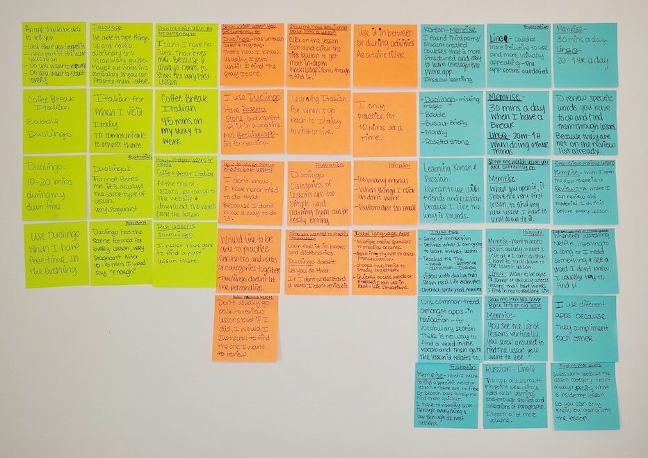
To synthesize and make sense of my user interview findings, I created a quick Affinity Map. I did this by jotting down the findings into sticky notes and organizing them by participant so that I could extract the common patterns found between participants, create categories and then dig deeper and create subcategories based on those patterns. The information learned through the affinity map helped me uncover insights that were further synthesized to define the user’s needs.
Insights
Users want to acquire vocabulary they can use in real-world situations.
Users want to study more effectively.
Users want to continue their lesson where they left off last time.
Needs
Users need the ability to have quick access to words they want to learn.
Users need the ability go choose the material that they want to study.
Users need access to their current lesson.
02. Define
User Persona
Based on the information gathered through market research, empathy map, user interviews and the affinity map, I was able to create a fictional yet realistic representation of Memrise target user and his true underlying goals, needs, motivations and frustrations as a language learner.
Creating a realistic representation of Memrise target user allows me to better empathize with the user, and the user persona will help me answer questions about what the product is to do and how it should do it, throughout the design process.
POV Statements and HMW Questions
With the insights and needs of my user Gabriel, gathered through the affinity map, I was able to craft the POV Statement and HMW Questions that helped me clarify and confirm my user’s needs in a human centered manner. I will use the HMW Questions during the ideation phase to help me brainstorm and uncover ideas on how I can solve Gabriel’s problems.
03. Ideate
Brainstorming
Using the How Might We questions created, I did a brainstorming exercise to quickly jot down ideas on how to solve Gabriel’s problems. For each HMW question I used the mind mapping technique where I spent 2-3 minutes writing down ideas, and once I went over all three of the questions, I came back to each of them and wrote down as many ideas as possible for another 2-3 minutes on each. This exercise helped me to quickly come up with a range of different possibilities on how to solve Gabriel’s problems.
Wireframe Sketches
Before I moved on to creating my sitemap and task flows I needed to create some low-fidelity wireframe sketches, to help me quickly sketch out on paper the key Memrise screens that would include the features that I have in mind, that will help solve Gabriel’s problems.
By sketching before moving on to the sitemap and task flows, I was able to think through the ideas more freely, see how I can implement them seamlessly within the existing app and it’s information architecture and get feedback from stakeholders and peers early in the process.
Sitemap
I then created a sitemap of the current app’s information architecture. This helped have a better understanding of the structure of the current features within the app and visualize how the new potential feature could seamlessly fit within that existing architecture.
Task Flow
Now that I have sorted out the information architecture through the sitemap, I moved on to creating before and after task flows, where I am able to showcase the steps that the user would take to achieve the goals before and after the new features are added. This helped me uncover any issues within the flow, see the gaps on the UI elements I plan to design and find out what screens will need to be created during the high fidelity wireframes stage.
High-Fidelity Wireframes
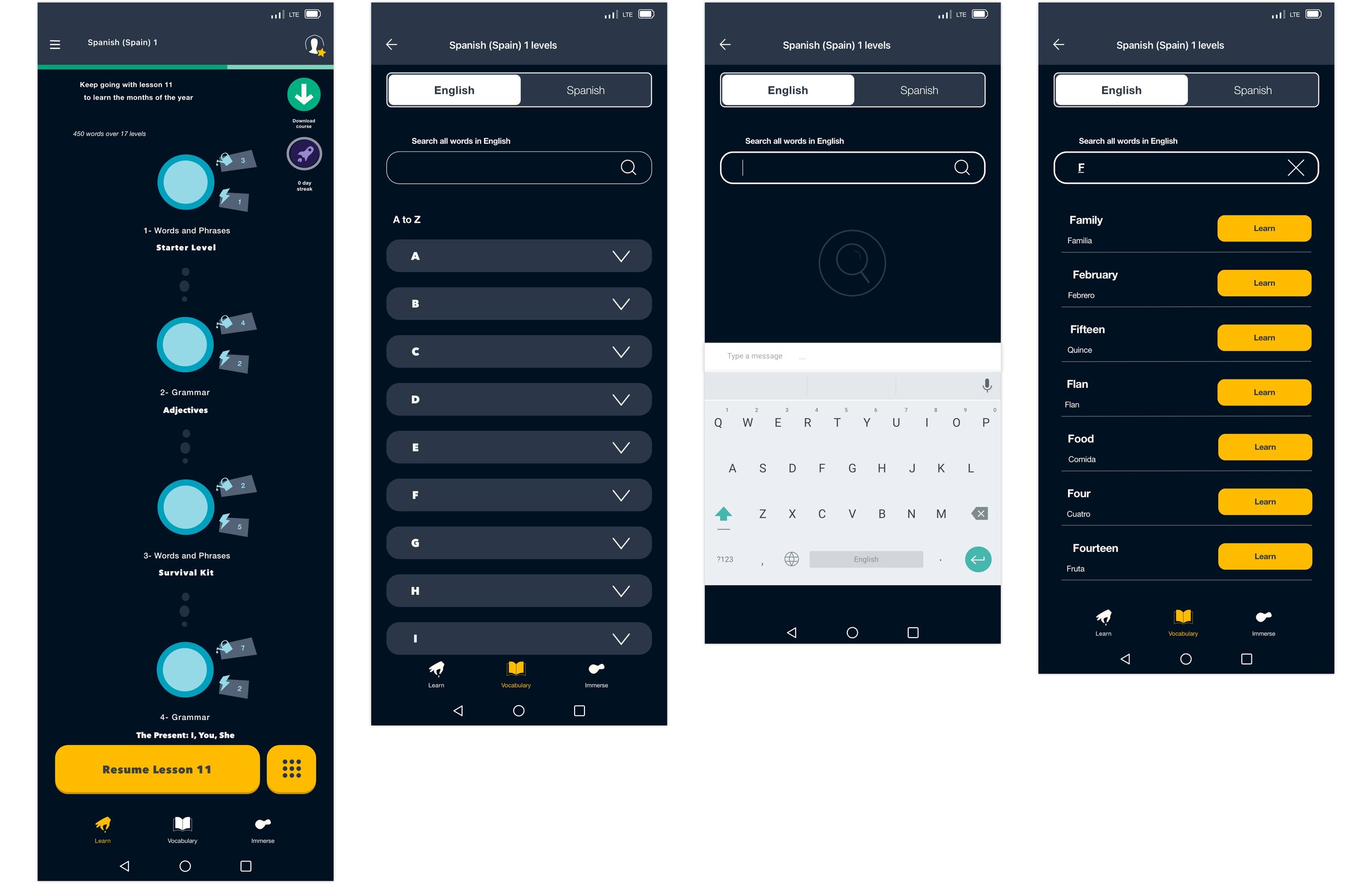
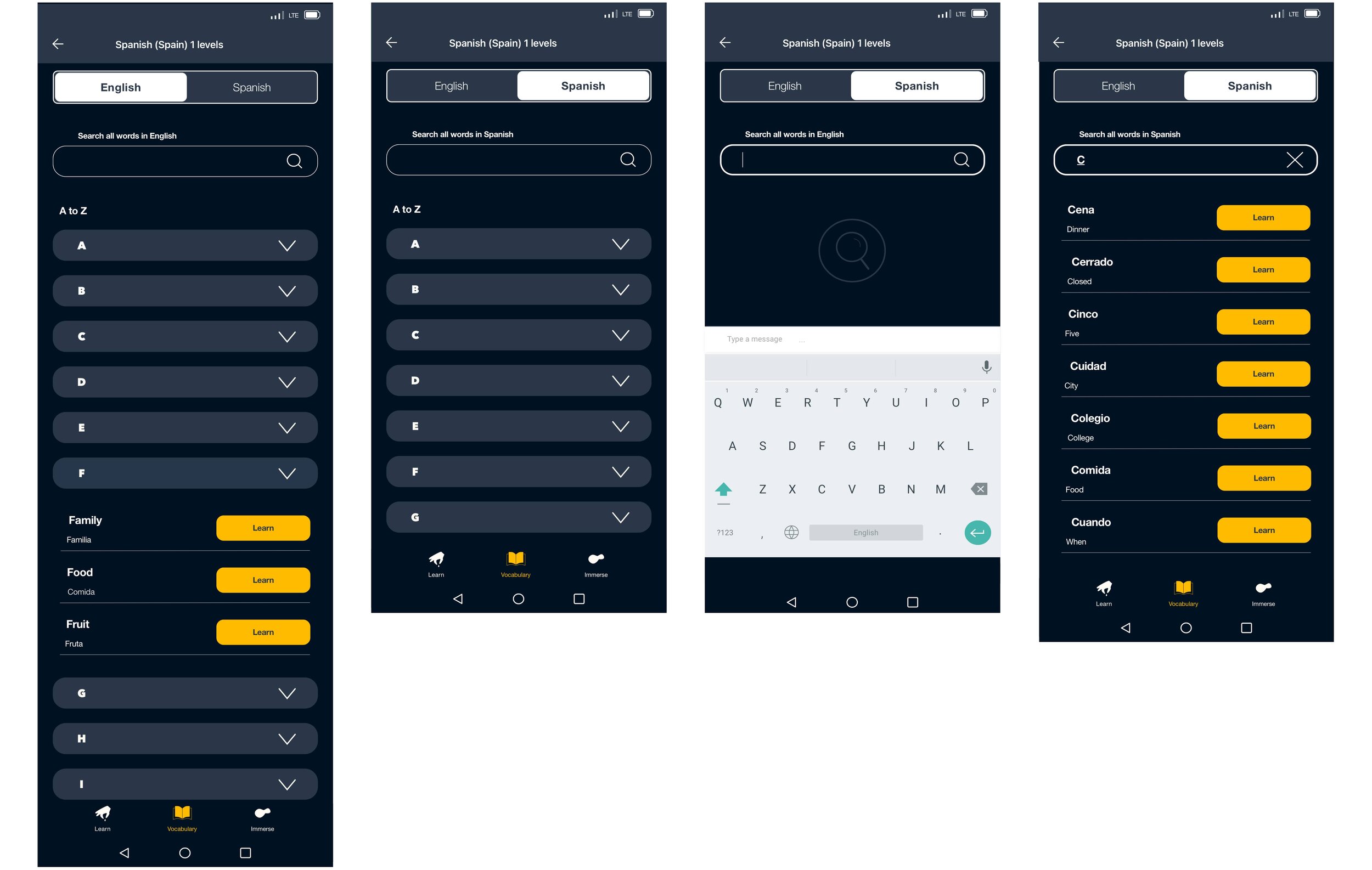
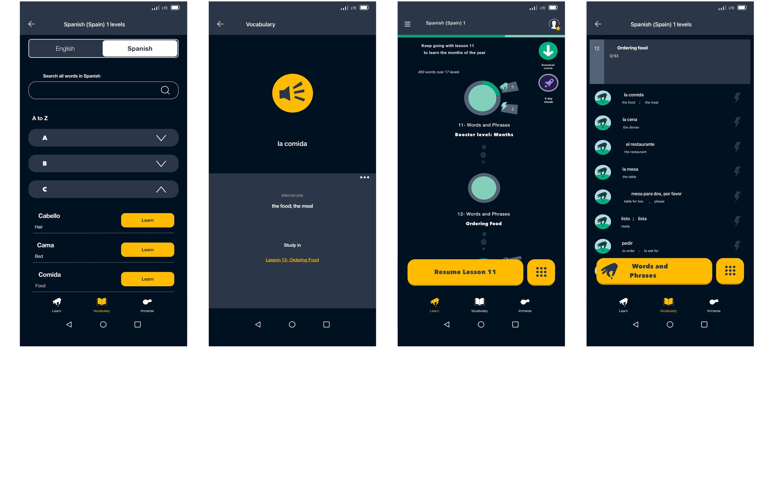
I then moved on to creating my high-fidelity wireframes based on the low-fidelity wireframe sketches, the sitemap and the task flows developed. I used Memrise existing mobile UI, design patterns and color palette, to create the new feature to allow users to easily find words that they want to learn and change the homepage main CTA button, to allow users to access their latest/current lesson without having to scroll. These high-fidelity wireframes were helpful to create the prototype for user testing and providing a visual representation of how the features will seamlessly integrate within the app.
04. Prototype
Prototype
Now I move on to creating an interactive prototype of the Memrise app with the high-fidelity wireframes created, to be used for the usability testing with participants and test out the new features added to the app. This prototype served me to test out the new features implemented, see if they are useful and if they integrate seamlessly within the app.
05. Test
Usability Testing
To gather usability feedback from participants and uncover if the new features of the Memrise app are useful, solve the users navigational and accessibility problems and integrate seamlessly within the app, I conducted a usability test with a total of 4 participants.
I recruited two participants that are current Memrise users to help me understand whether these new features meet their expectations and validate the solution, and the other two users, were non-memrise users and they helped me see how they discovered and used the features and the intuitiveness of the app with the new features.
Through this test, I was able to uncover gaps within the design that caused confusion for the users, and validate or invalidate any assumptions that were made along the design process.
I created a Usability Test Plan to use a guide for how the tests would be conducted.
Overview
Conducted a moderated remote usability test through Zoom. Acted as the moderator and encouraged users to think aloud during the testing process. This allowed me to learn more about their thoughts, behaviors, goals and motivations as they are performing each task.
Participants
Number of participants: 4
Age range: 29-44
Gender: 3 Male and 1 Female
Tasks
Find the current lesson that you are on.
Find the word for “Food” in Spanish- “Comida”.
Learn and practice using the word “Comida”.
Navigate back to the course’s Learn homepage.
Affinity Map
After usability testing, to organize and synthesize the findings gathered, I wrote down all the findings into different colored sticky notes, organized them by task and questions asked and then extracted the most common patterns and pain points amongst the participants from the Affinity Map. From the pain points, I was able to extract the insights that were then synthesized further to reveal the recommendation for the iterations needed on the design.
Insights
Issue 1
Users mentioned wanting the ability, within the vocabulary page (through the search bar or letter menu) to search for the words that they want to learn in English, their native language, instead of the language they are learning. As they expressed that by allowing them to find the word in English, they would find it much faster.
Recommendations
Fix 1
To allow users to search (through the search bar or letter menu) for the desired word, in this instance “Food” in English. To make this happen, I recreated and applied the navigational flow on the English vocabulary page that is found in the Spanish vocabulary page.
06. Iterate
Priority Revisions
Based on the recommendation found during the affinity map exercise, the priority revisions to the high-fidelity wireframes and prototype were made to insure a positive and useful user experience.


Prototype- Iteration
Once the revisions to the high fidelity wireframes were made and the new pages were created, I made the updates to the Memrise prototype.
Reflection
This was the first time that I did a project where I had to incorporate a feature into an already developed and very popular language application like Memrise.
Coming into this project I knew that I wanted to add a feature to the app that eased the pain points that my family, friends and users like myself, have had with the app when trying to access our latest lesson, or when we wanted to learn a particular word, as there is no shortcut to achieve this currently. Once I conducted empathy research and found out that this was a true pain point, I was able to focus on how to solve for those needs while making use of the existing information that lives within the app, learning in more detail about the Memrise app, and learning how to utilise different methods to help me find the solution.
Understanding Existing Design Patterns & IA
During this project, I was able to learn in more detail about the Memrise design patterns and understand why certain choices regarding their IA and navigation that exists within their courses, were made. Through this exploration, I understood more in depth on how users are able to access their latest/current lessons and words they want to learn through the app’s slightly rigid course structure, and find the gaps where improvements could be made. Due to that, I was able to identify where the new features for accessing lessons quickly and finding words that users want to learn, could be implemented without having to re-create the information architecture or the design patterns, but by creating a path that allows users to access lessons and words without feeling lost or confused and by interacting with design elements that they are familiar with within the app and outside of the app.
Being open to using methods in different ways
One thing that I learned from my first project and that carried on to this project, was learning how to use the each method to help yield insights needed during each phase of the project. I learned during this project that is there is no straight linear path to follow when it comes to UX Design. That one can use the methods one knows in different ways, to help you uncover insights needed to be able to move on to the next step. For example, I learned how to create an empathy map based on my assumptions on how what the user feels, does, thinks and says when interacting with the app, to able to put myself in the shoes of the user and think about what I think I know, what I know and don’t know based on those assumptions. Then, be able to draw from those assumptions and questions I have made to myself, the questions that I needed to ask during my uses interviews. Before I had used the empathy map to synthesize information from my user interviews, so it was quite nice and fulfilling.
Next Steps
Design Implementation & Hand-off
Now that the design has been tested, revised, and completed it is ready to get discussed in detail with developers about technical limitations. To achieve this, I have put together all of the product deliverables, using the Zeplin tool, for handoff to the developers and will schedule a meeting to explain further. After handoff I will continue to be available to assist or answer any questions that may arise during the development process.


